Ever tried modelling?
Subtitled: David Pennock’s Wall-Street pick up lines
Dr Pennock’s latest post is about fitting stockmarket data — he comes up with a nicely matching randomly generated histogram based on a Laplace distribution over the daily log differences (that is, take the log of the ratio between daily close prices — so if you gained 20% in a day, take the log of 1.2). As well as pretty pictures, logs of differences have the nice property that their sums and averages are actually meaningful — if you invested $p, at an average log difference of x over n days, then your total at the end of the n days is p*enx.
Dr Pennock doesn’t state the figures he came up with, but by my maths (well, R‘s maths assuming I issued the right incantation, and Yahoo’s data) the 60 year average (between 1950 and 2010) daily difference for the S&P 500 is 0.0004596 (with a variation of b=0.006505). Annualising that (ie, multiplying it by 365) and converting it to a percentage ((ex-1)*100) gives an 18.2% annual return over the fifty year period. All very reminiscent to the way of thinking about interest via logarithms I posted about some time ago.
Of course, you only get that result by averaging some really good years and some really bad years, but there’s no reason you have to apply the model to exactly that fifty year period — you could, eg, apply it to 365 49-year periods starting anywhere up to a year after the start of data.
One of the things Dr Pennock notes is:
At the aggregate level the stock market is well behaved: it’s randomness is remarkably predictable. It’s amazing that this social construct — created by people for people, and itself often personified — behaves so much like a physical process, more so than any other man-made entity I can think of.
If the stockmarket were a random physical process — like beta decay or similar — the parameters pulled from the statistical fitting would have a physical meaning, and scientists would look at them to see if they were fundamental constants or if (and how) they varied depending on external influences. These parameters probably can’t be given too much meaning because they only relate things to the US dollar, which has all sorts of other influences, but at least we can have a look at how the parameters change over time.
(I sat up late reading Feynman anecdotes last night. I’m trusting taking a physics-esque approach to questions will be a short-lived consequence)
Anyway, taking 20-year periods gives us 40-years worth of data points (ie, investments beginning from 1950 to 1990; or equivalently ending between 1970 and 2010). Graphing the mean and variation for 400 of those periods gives something like the following:
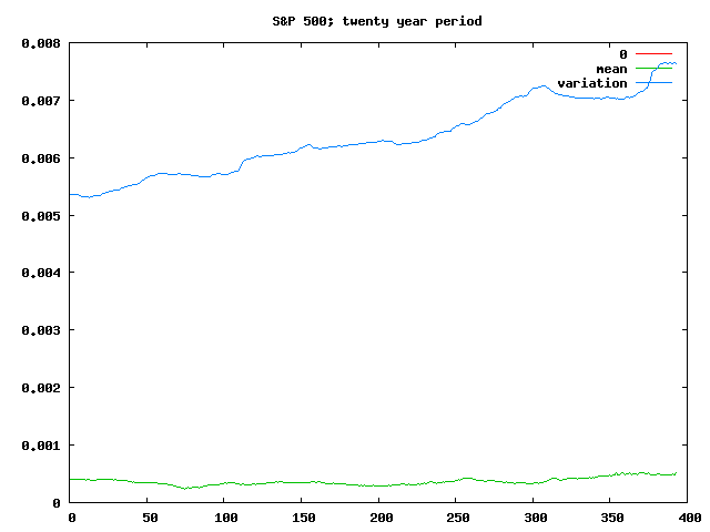
An interesting thing to note from that is that the mean is both positive and fairly consistent — meaning that if you invested your money in the S&P 500 for 20 years, it doesn’t much matter when you did it, the log of your daily returns would average between 0.00025 and 0.0005 (generally in the 0.0003-0.0004 range) — which by the maths above means an annual return of between 9.5% and 20% (generally 11.5% to 15.7%), which compounded over 20 years is between 521% and 3757% (generally 794% to 1757%). It’d be interesting to see how that changed when adjusted for inflation.
The other interesting aspect of that chart is that the variation seems to be gradually increasing — meaning that while the overall result of the 20 year investment is roughly the same (in so far as a 6x return and a 38x return is “the same”), on a day to day basis you can expect to see both larger gains and larger losses in more recent investments.
If you start reducing the investment period things get a bit more lively, though. With a ten year investment, if you have particularly lousy timing you might have no more money than you started with:
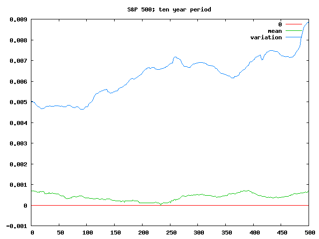
The variation isn’t as stable here either — you can pick some periods of fairly constant variation, some increases and this time even some decreases. There’s also a very sharp increase in the variation fit for investments that span the last couple of years.
Shortening the period still further to a five year investment gives us the possibility of ending up with less cash than we started with:
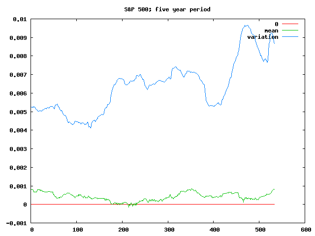
Though it’s worth noting both that losses are still pretty rare at that point (pretty much limited to people trying to cash out during the 1970s by the looks), and that even investments that ended anytime in the past five years or so look like they should have made a reasonably healthy profit (financial crisis or not).
Investing for a period of just one or two years is still somewhat reasonable, but you’re starting to have some bigger risks of losing money, and it’s getting hard to predict just how chaotic things are going to seem if you check your net worth every day.
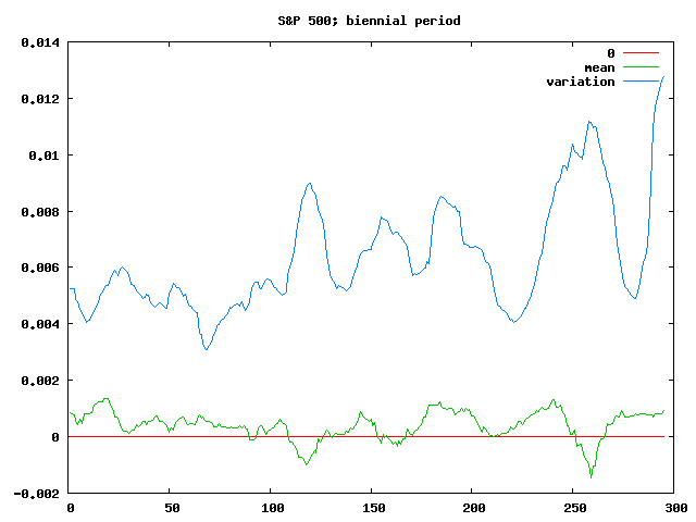
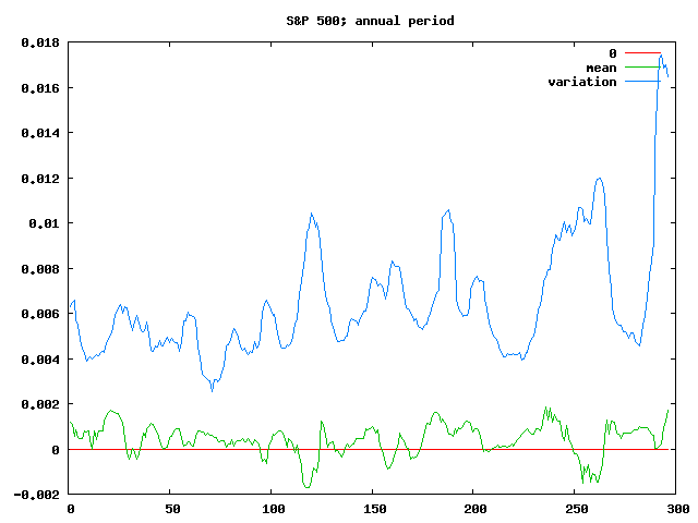
Of course, the modelling is breaking down at this point too; without lots of data, guesses at the mean and variation aren’t going to be incredibly meaningful. So if you shorten the period further, to just a month or a quarter, you get pretty useless results:
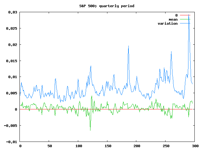
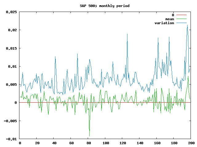
In general, though, the Laplace analysis seems to support ideas about index funds and long term investing being productive and relatively save ways about dealing with the sharemarket, and possibly provides some interesting ways to analyse different funds.
At least, if I’ve been doing my maths right, anyway…
Thats some nice rational thinkng and some nice charts.
I think you might like the Stubborn Mule:
http://www.stubbornmule.net/
Cheers,
Erik
Fascinating. Nice analysis. I don’t have a hypothesis why volatility should be going up over time, especially with no change in mean return, but it certainly seems like a real trend. BTW, I get almost exactly the same median (0.000453618) and average absolute difference (0.00649569). Also, for some reason your comment on my blog got stuck in my spam folder until a noticed it and approved it. Thanks.